

I’ve also created a companion video for this post.
One of the best tools to use when planning are pen colors. Using differing pen colors can help you to analyze—at a glance—the most important tasks. All note taking and PDF annotation apps usually come with the same preset, default colors. These can become repetitive and boring. They don’t give you enough options for different categories or for differing level of importance. But most of all, these generic colors aren’t usually complimentary to your personal tastes. Luckily, most—if not all—of these same apps allow you to add custom colors to your pen selection. But which colors do you choose? How do you make sure the colors you choose are cohesive? Today, I’m going to show you my favorite, quick and easy way to make a cohesive and custom pen color palette for your digital planning needs.
My favorite resource for my pen color palettes is Google images. When picking a color palette, I like to choose a theme that will remind me of a fun memory. This makes planning that much more fun, enjoyable and even relaxing. For me, I like to use beach color palettes. Because some of our best and most memorable family vacations were at a beach.

As you’re going through the Google images, I recommend making sure that the palettes you pick have a darker color in them. These colors will be used for writing on white paper and lighter colors; such as, lime green, won’t show up very well. After you’ve perused through the images on Google and have saved the images that you like, you can now start creating your palette.
I recommend using an app like Procreate. You can pick specific colors and it will display the hex number for it. Also, by using an app like this, you can easily backup your color codes file, making migrating to a new device easy. After creating a new document in Procreate (I just create a screen size document), you can now start importing your images into Procreate.
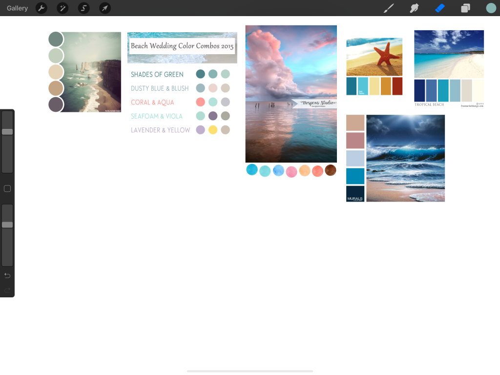
Next, go through all the colors, using the eye dropper tool and create swatches of the ones you definitely want to use. As you do this, be sure to keep in mind what you might use certain colors for, for example, yellow for important tasks.

After you have determined all the finalists for your custom palette, you can now start testing to make sure that they’ll work on white paper. They shouldn’t be too light and hard to see; but also, not too dark, as to blend in with the black. To do this, I recommend writing a short phrase in each color—excluding ones that might be used for emphasis (like the yellow in the previous example). I like to use the phrase: “hello there,” just because it’s fast and usually the first one I think of off the top of my head. This test will help you narrow down the wide selection of colors you picked previously.

You now have your custom color palette! Now all you have to do is enter the hex numbers into GoodNotes, or whichever note taking/PDF annotation app you’re using.
Let me know if these tips help you make planning more enjoyable and fun. Comment with some of your own ideas, share your color palettes and memories behind them! Be sure to check out the digital planners that we sell on our store.

Thanks for taking the time to read my blog!
Be blessed,
Rinne